Reflections on Painting Lily
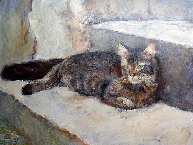
I view my progression in painting to climbing a giant never ending stairway. At first, consistent focus will move you rapidly up the stairs. As a veteran painter, it has become more difficult to reach the next step. It can be frustrating waiting for a ‘jump’ in skill that manifests itself in a painting you are working on. This painting of my cat Lily is one of those paintings that produced gains in areas I had been focusing on during the last couple of years. Painting, to me is a visual result of ideas. I believe it is ideas that produce technique that ultimately produces the image an artist seeks. I am constantly trying out new ideas in my painting. Teaching also inspires me to test my ideas and to head off in directions I might glean from working with art students. We are ALL art students and will be our entire lives. In this blog I will explore some of the ideas involved in my painting of Lily.
The Beauty of Contrasts
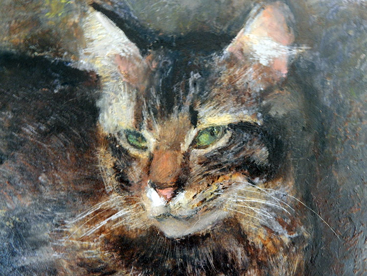
The idea behind this notion is that a painting is a magical balance of contrasts. Loose passages highlight tight passages and vice versa. Dull color enhances bright, calm areas highlight busy etc. In each duality, there is a magic ratio. I avoid a 50/50 balance where each cancels out the other. One of the partners needs to be dominant and the other partner provides the relief from that dominance. In the painting of Lily, I worked hard on some details in her face, which provides relief from looser handling of her fur. My use of the palette knife provided a new texture to the painting and provides relief from tighter ‘drawing’ aspects of the painting.
Under Painting
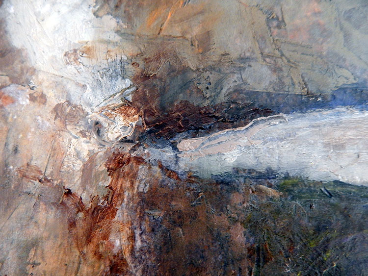
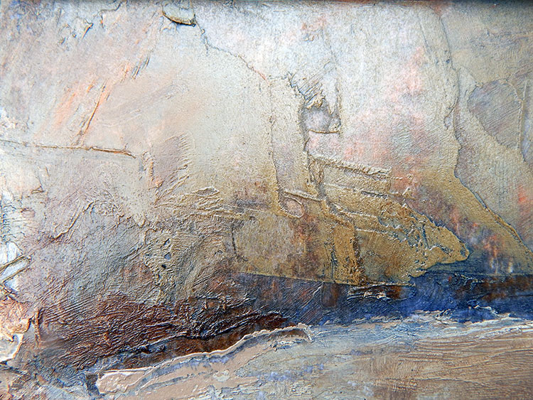
Awhile ago, I had some leftover color from a batch of oil sticks I had made. On a whim I added some oil to create a more transparent color. The color ended up being a color I dubbed ‘transparent dull purple’. This color immediately inspired me. You could add a bit to any color and neutralize it in a unique way. You could lower a value easily with a dab or two. This color seemed to make other colors ‘sing’. In the painting of Lily, I completed an underpainting of ‘transparent dull purple’ I applied it over my rough image of Lily, keeping it loose and not fussy in any way. I began painting Lily by working directly into the wet under painting. The cool purple tones seems to make the warm colors of Lily’s fur really stand out. This purple tone unified the painting. I left areas of the ‘magic’ color to shine through the layers I applied over it.
Details
I have struggled to find ways to improve my ability to paint details with my oil sticks. I’ve used a huge variety of tools in this quest from dental tools, lollipop sticks, sharpened chopsticks to techniques using small brushes and palette knives. I have using ‘wiping out’ methods and had done a variety of techniques that involved scraping lines out of wet paint. Before this painting of Lily, I hadn’t quite been able to put it all together successfully.
Palette Knife
I have always been intrigued with palette knives and what other artists are able to do with them. Their skill seemed intimidating in its brilliance. I wondered if I could gain skill with them, or if it would take twenty years of practice to get anywhere with them. This year I dove in and accepted the challenge. It takes while to know how to get the paint to the right part of the knife and how to make lines and other effects. In this painting I began to see some progress in my skills. The rocks and stairway in the painting was a great opportunity to concentrate on using the palette knife. When the underlying textures dried, I applied thin glazes over them which created a heightened texture I had not been able to get before. It brings out the detail in Lily’s face.
Total Effect
When is a painting ‘finished’? This question has intrigued painters for centuries. Each artists pursues their own vision to answer this question in each painting. I find many paintings I see to be too ‘finished’ for my taste. Fantastic high definition photo images have seduced artists into seeking highly polished photo effects. It’s like the detail of a bubble of dew on a leaf. The details of the bubble can render the leaf uninteresting. I distrust detail, but you need some well placed detail to bring a painting into focus. Without any ‘tightness’, a painting can look like you need a good pair of glasses! My idea is what I have jokingly called Paul’s Rule of 80/20. I feel that 80 percent of the work is in the ‘cake’ and the remaining 20% is in the ‘frosting’. The detail is the frosting. Good tasting frosting is not much good on a bad tasting cake! In this painting of Lily, I feel have a really good ratio of ‘cake’ to ‘ frosting’! The effect is of adequate detail, but a close look reveals much fun and loose painting! I don’t want my painting to look like I worked 1000 hours on it! I want it to look easy!!
Summary
I like this painting. It is like a glimpse over the hill to see a sparkling vista of possibility. Will I ever get to the artistic ‘promised land’?? Probably not, but to get a faint glimpse gives me hope! My image of Lily is far from ‘perfect’ but it has a pleasing effect that is the result of a good combination of ideas and experiments…….and it looks just like her!!!

