A Pathway to Strong Composition
Composition is something that was not stressed much in art school. You don't see much written about it anywhere. It's as if it is some weird science that few seem interested in. I think composition is what makes one painting a 'winner' and another one a ho hummer that is easily passed by. Any talk of 'rules' nowadays is a sure bet to cause yawns and glances at smart phones. I dislike the word rule anyway. Rules are simply ideas and there is no problem breaking them or following them when it seems appropriate.
Pathways
I have always enjoyed painting trails, roads and 'pathways'. Paths are a metaphor for a journey which is leading somewhere. What lies ahead? Is there a destination? There is an inherent mystery in a path. We are all following one! Composition involves setting a path for the viewer's eye so that it takes a journey throughout your painting. If you design a visual path, many of the so called 'rules' become common sense. You don't want to have the viewer staring over in a corner of your painting at details you put there. You don't want a design element right in the middle of your painting , so it divides your painting in half. You don't want 'visual fences' that prevent an easy entrance for the eye of your viewer. You don't want "design repetitions' that negate the emphasis each would have on its own. There seem to be quite a few 'don't wants' to be talked about, but what do you WANT to have in your painting? This seems to be more of a mystery.
Easy Entryways
You want your viewer to enter your painting without impediments. I like to enter a painting on diagonals. Since I am right handed, many of my entry points begin at diagonals from the lower right hand corner of my compositions.
Focal Points
Having one focal point is a really good idea. A focal point is often the 'story' of a painting. What do you want to emphasize in your painting? That is the story. It is also often the reason for the painting itself. Sometimes I will ask a student artist to write a small paragraph that describes why they chose to make a painting of this subject. This will help define what the 'focal point' could be and what could be emphasized. If you have multiple focal points, you will confuse your viewer. A painter is like a director of a movie. If the director is confused about staging the scene, the audience is sure to be confused! Having a strong focal point doesn't mean that the rest of the painting can be uninteresting, though. It's like a chef making a plate of food for a patron. He or she wants the whole plate to look and taste interesting. Every vegetable has to be visually interesting and tasty. She would never have some canned string beans mindlessly chucked into a gourmet meal! Each item on the plate is important in the presentation of the whole. It is the same in painting. Some parts might be more important, but each part has a function that contributes to the final painting.
Abstract Design
I believe every painting is an abstract painting. All paintings involve marks on a flat surface. I find I like to have abstract design 'underneath' my compositions. Some involve zigzags, S' shapes, circles, triangles, X shapes sometimes occur. I favor an intuitive sort of composition. My composition is the result of having done hundreds of paintings and making thousands upon thousands of design decisions. I trust my intuition and all artists need to develop a trust in their intuition to help guide them in their artistic decisions. You are the boss, so take charge!!
A Few Examples

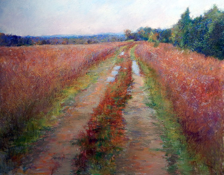
This is a classic pathway painting. It is simple at straightforward. You eye travels up the path into a misty background and is entertained along the way. The reflections in the puddles are important to the painting. They link the ground and the sky and also provide some visual interest in the middle of the journey. Without them, the painting would be a good deal less interesting. I put much time in the grassy field, adding layers of colors and textures. The field takes up a great of space so needed to be visually interesting. The strong angles of the path are balanced by the more horizontal line of the horizon.

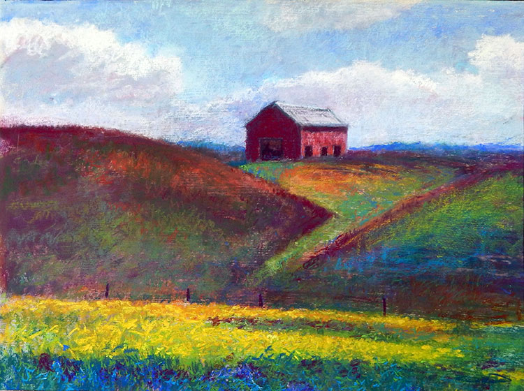
This painting was done on location. It's a "Z" type composition with the barn on the hill being the focal point. The simplicity of the design makes it strong and graphic. I did this painting over twenty years ago and still like it. Times have changed but I drove by this scene not long ago and it looks the same!

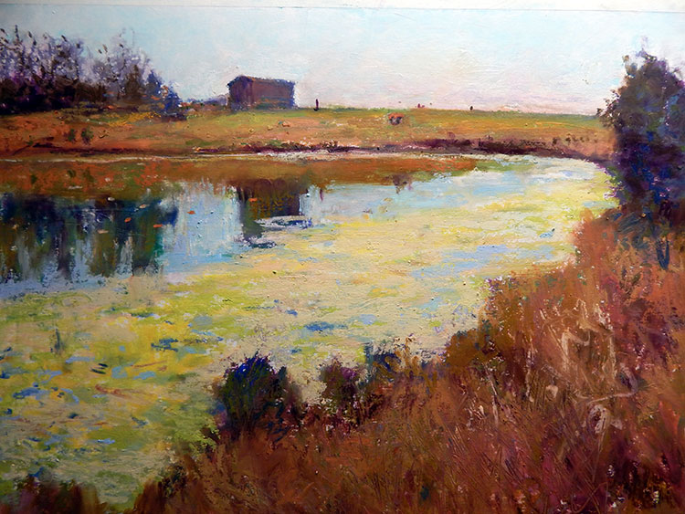
This painting is rather 'circular'. Your eye moves from left to right on an angle , up the shoreline and on to the barn and back around forming a circular path. The barn reflection links the background to the foreground. Those links are great to have. They are like the twine that holds the hay bales together! They give your composition more strength and coherence.

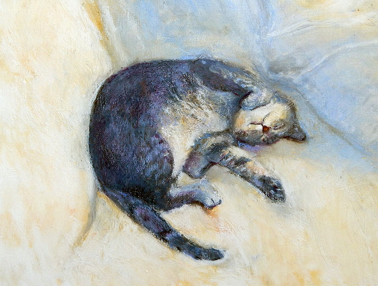
In this fun painting of my Uncle David's favorite cat, the underlying abstract design is like a figure "8" with the focal point being the cat's face and with the viewers eye being lead around in a circle and returning to the face. I think circular compositions can be very successful.

